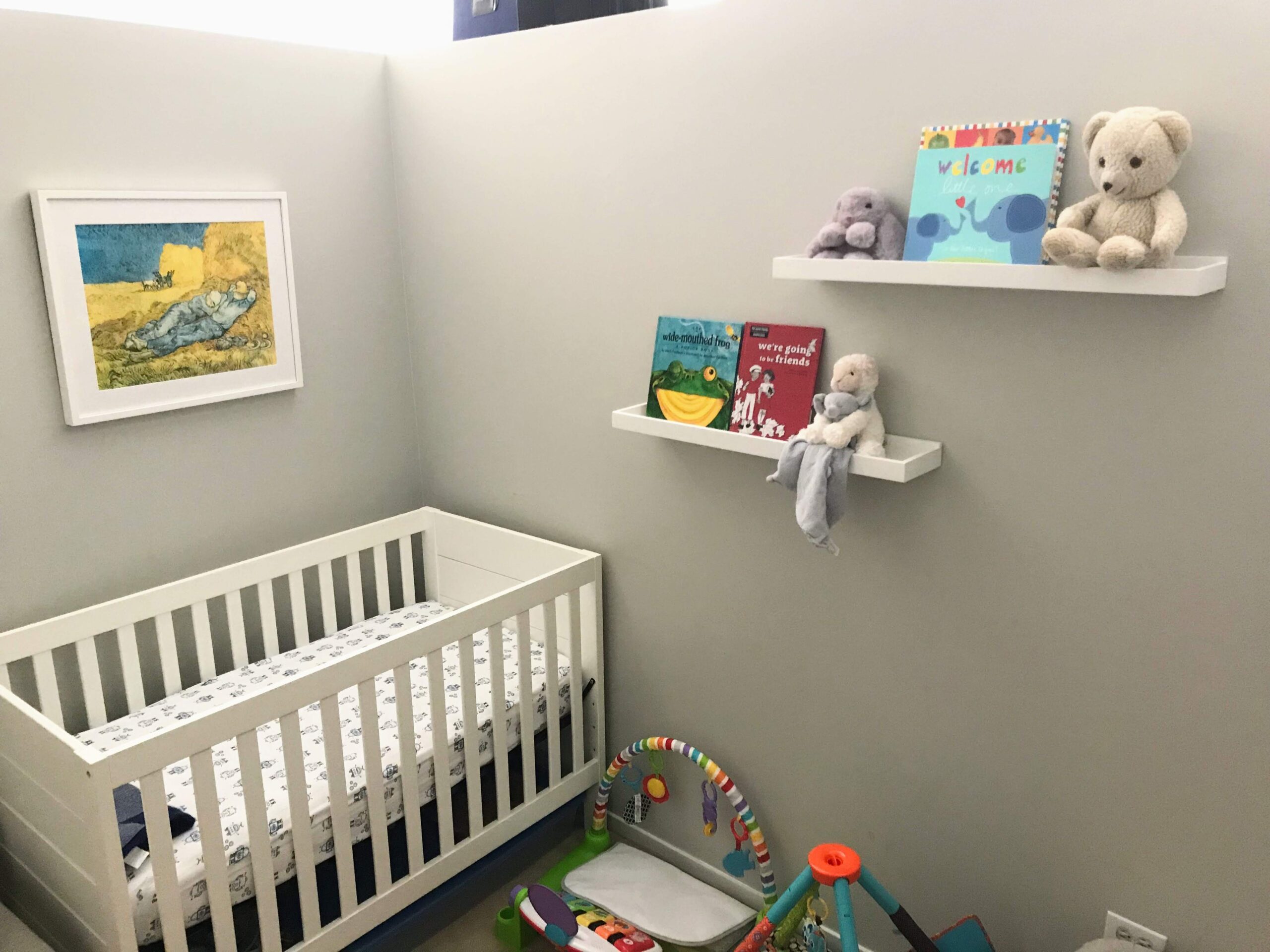
There seem to be a million steps to prep your home for an incoming newborn, though not many first ponder their choice of custom-framed artwork. For Amanda and her husband, Nolan, their greatest joy next to finally bringing home their baby boy was decorating his room. When choosing artwork for the nursery, a vintage art print that had been in Amanda’s life since her childhood became a focal point to include in the space.
“This Van Gogh poster, The Siesta, belonged to my mother. She must have gotten it in the 1980s from an art festival or a museum gift shop.” Amanda recalls the family history of the artwork. “I remember this image hanging in our sunroom when I was a little girl. The poster was framed with a mustard yellow background which became dated over time. Eventually, I inherited this piece as college dorm room artwork, and thereafter, it followed me to Chicago where it has hung over the years in various apartments.”
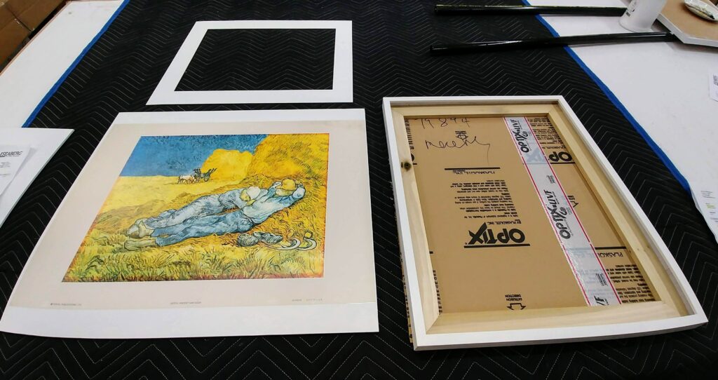
When Nolan and Amanda moved into their current condo, the aged mat and outdated framing of the well-loved poster didn’t fit the modern aesthetic of their home and was put into storage. “Because I have had it for so long and it belonged to my mother, I just could never get rid of it. It ended up in the laundry room and became water damaged.
Nolan chose Seaberg to provide custom framing and breathe new like into his wife’s treasured poster. “They modernized this classic piece of art that had been in an outdated bubbled up the frame for so long.”
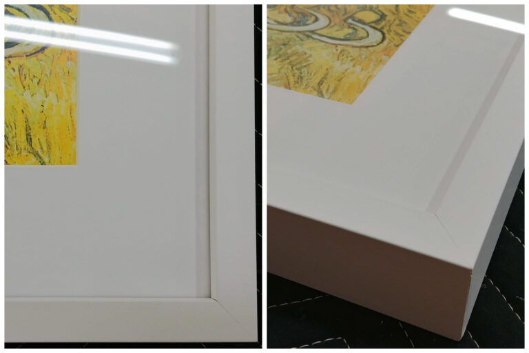
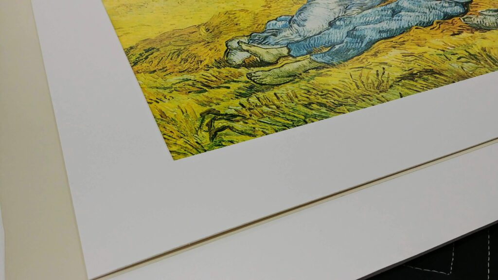
By having the piece custom framed in a clean-lined, white picture frame with a simple white mat, our staff was able to hide any water damage and let the colors and textures of the art stand on their own, without distraction. To Amanda, the results speak for themselves. “It means so much to me to have such a special piece re-framed. The Seaberg staff gave my poster a modern, fresh look.”
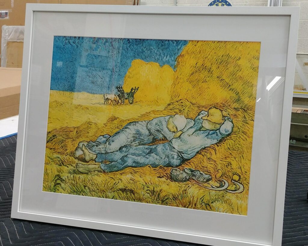
After updates to the poster, the framed art found its home in the baby’s nursery in a place of honor over the crib. “This piece is now hanging in our soon-to-be nursery, and we couldn’t be happier. The blues and yellows in the poster compliment our gray walls and the white background really makes the artwork pop. It looks amazing!”

